
How often do you find using an application or website that works properly on your PC difficult on your mobile phone? If that happens frequently, it’s likely because the app or the webpage wasn’t properly optimized for mobile usability. Such limitations can lead to lower traffic, lesser conversions, app uninstallations, abandonment, and reduced user loyalty.
Sources state that over 96% of internet users access it through mobile devices, and the average time spent is approximately four hours a day. Hence, not prioritizing usability or user experience for mobile users can act as a key cause of not delighting the user base.
Let’s understand what optimization for mobile usage means, its importance, and best practices.
What is Mobile Usability?
Mobile usability refers to the convenience or ease that users find while accessing and using an application or website through their mobile devices. The convenience parameters include speed, accessibility, usage, and screen size. This is also known as user-friendliness and responsive design within applications and websites for mobile applications.
Since a larger public is accessing the internet and applications through mobiles, it is pretty crucial for developers and companies to prioritize boosting the usability of their applications and websites. Here, user delight comes into the spotlight, which reflects a positive and meaningful user experience.
Understanding Usage Convenience of Mobile Devices:
Usability defines how seamlessly and effortlessly users can use an application or a website on mobile devices. Alongside that, how comfortably users are using their phones while accessing an application also matters here. To enhance user-friendliness, it is essential to assess how individuals are using their mobiles. Typically, mobile usage can be categorized into three ways: one-handed, cradled, and two-handed. Furthermore, it is notable to mention that individuals mostly use mobiles with their thumbs.
Experts suggest over 49% of people use mobiles one-handed, 36% use cradled, and only 15% use phones with two hands. So, if we distribute mobile usability according to ease and difficulty, we find three zones- easy, stretch, and hard. We can imagine these zones with colors- green, yellow, and red, respectively. Easy or green defines the areas that users can reach comfortably. In the yellow zone, users need to stretch their fingers. The third parameter denotes the area that is difficult to operate in.
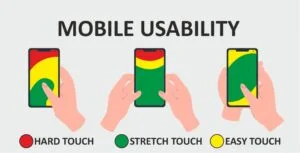
While using one hand, the easy-to-reach areas are limited. Conversely, the stretch and hard areas cover the mobile screen. On the other hand, in cradled usage, most of the zone is either easy or stretched. Lastly, while using two hands, the usability of the mobile screen is mostly higher with expanded easy or green zone.
Therefore, optimizing applications for mobile usage signifies expanding the easy zone and reducing the stretch and complex area through an easy-to-use design. The process also includes thumb optimization within applications.
Why Prioritizing Mobile Usability is Necessary?
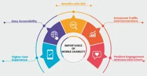
Since most people use mobile phones to access the digital world, mobile-friendly app and website development is unavoidable. Designing applications or websites with a focus on mobile friendliness offers easy accessibility to users. They can seamlessly and flexibly locate the sections to fulfill their requirements.
Such an approach contributes to boosting user experience with easy navigation to important sections of the application. It also offers flexible usage to users, allowing them to fulfill their requirements easily.
Mobile responsiveness for websites is also advantageous from the perspective of search engine optimization (SEO). The largest search engine, Google, prioritizes ranking websites with higher user experiences and mobile friendliness. Optimization for mobile usage also indicates user delight and positive engagement. This can lead to limited user churn and boosted traffic and conversions on a website.
Best Practices to Enhance Mobile Responsiveness:
Design Responsive User Interfaces:
A responsive user interface (UI) will allow users to easily navigate and access important sections of an application or website. While accessing through mobile phones, the design should enable users to effectively use the essential features without facing any difficulties, irrespective of their usage methods, like one-handed or two-handed.
Touch-friendly elements, easy-to-use and navigate, responsive design, readable content, and optimized performance are the core components of a mobile-friendly user interface.
Prioritize User Experience:
Offering a positive user experience is crucial while developing a mobile-responsive website or application. The design should allow users to seamlessly access and function through their mobiles. The experience should be seamless without latency. User-centric interface, consistency, opportunities for feedback, compelling visuals, convenient navigation, etc., are the crucial aspects for enhanced user experience.
Focus on Thumb Optimization:
The basic way of using a mobile device is to grasp it with one hand and operate the touchscreen with the thumb. Therefore, it is significant to adopt a design that can complement the thumb movement of the users. Designers must put all essential keys in the green zone, according to the above-mentioned example, making them easily accessible through the thumb. The less critical elements can be placed in the yellow or red zones.
Conduct Mobile Usability Test:
Testing allows for identifying the weaknesses within the design and fixing them. Hence, testing or evaluating the mobile friendliness of apps and websites is a critical segment. The method additionally assists in monitoring and meeting the goals of usability. Testing from a realistic point of view can help understand how real users will use a particular application.
Developing Mobile-friendly Websites and Applications!
In the digital age, designing customer-centric products and sustaining a positive user experience is a common practice. Since more and more people are embracing technology, it is essential for developers to produce innovations that not only fulfill the audience’s needs but also offer a seamless accessibility and usability experience to the users.
While optimizing mobile usability, developers must focus on including the most essential key in the green or easy-to-reach zone for users. In this regard, developing a mobile-first design can be beneficial, as it will allow developers to prioritize designing for smaller screens that have a bigger user base. Thumb optimization and user delight should be at the forefront while enhancing mobile usability.
Discover more informative blogs with YourTechDiet and stay acquainted with the latest trends and practices!
Recommended Reads:
Mobile Phishing: Myths and Facts
Navigating Through 6 Buzzing Mobile App Development Trends